Have you ever wondered how safe your car is?
How Safe Is Your Car (HSIYC) is a digital service provided by Victoria's Transport and Accident Commission (TAC). It enables people to make the safest choice in car for them and their family by searching, browsing and comparing the safety ratings of vehicles; and educating consumers about recommended safety features.
In 2019, 232 people lost their lives on Victorian roads. The TAC and the Victorian Government believe that zero can be the only acceptable number. The thing is we can all make a difference. By driving at safer speeds, making safe decisions, building safer roads and by choosing safer cars we can bring that number down. The challenge was how do we get people to choose safer cars by bringing together the abundance of existing car data available to everyday people and present it in a way that’s easily understood and useful?
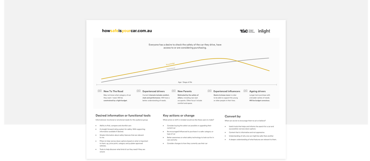
Working with car safety experts from TAC we soon learnt what makes a safe car and who could benefit from using this website.
We then also identified that these users desired. Clear information, simple functionality and of course everyone cared about budget. But depending on their lifestage we saw that as experience is gained so is knowledge about cars and their safety.
So at one end of the spectrum when we are new to the road and the other end when we have been driving the same car for long periods of time do we see these people as being out of touch or unaware.
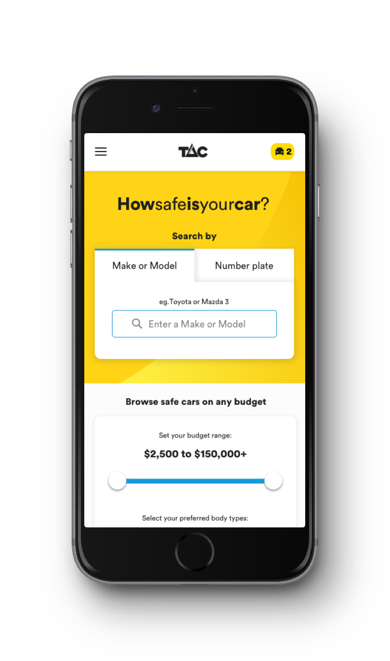
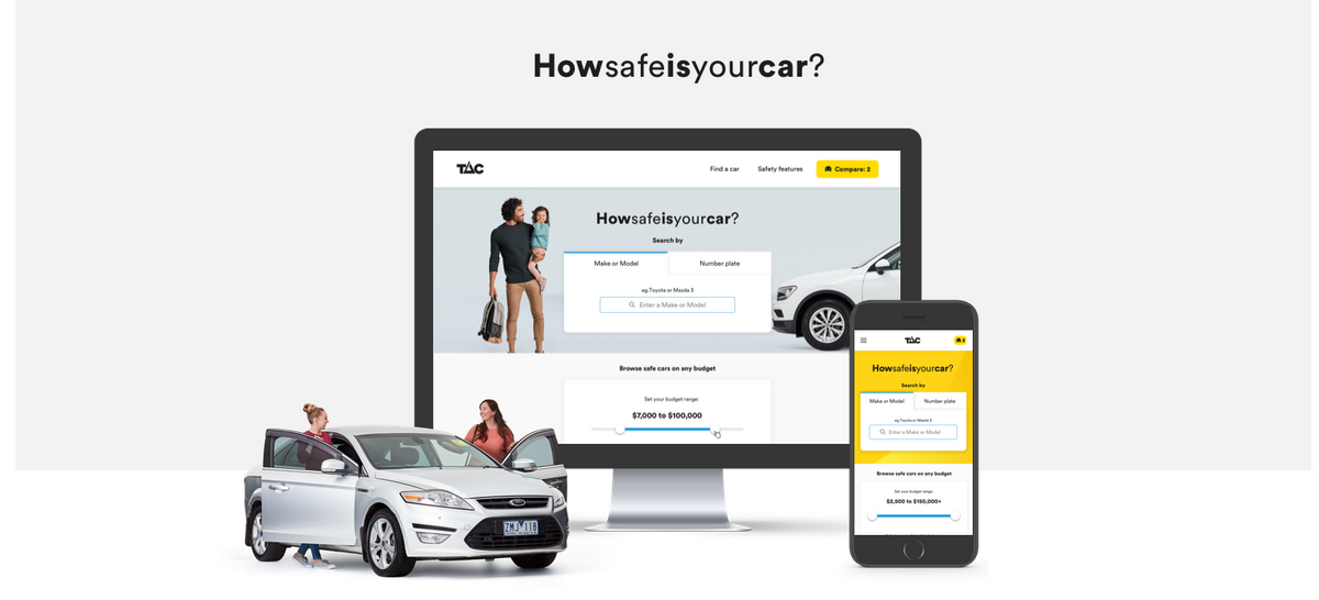
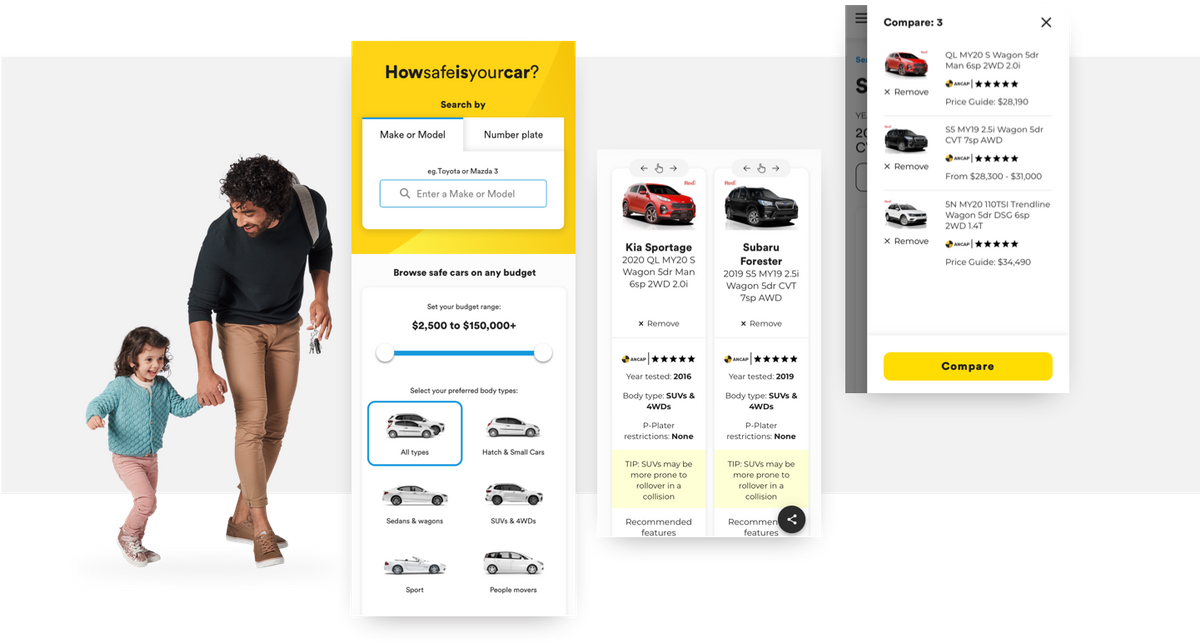
We designed two main paths, searching and browsing. The first enabled people to find the information about a specific car as quickly as possible by looking up make or model or by simply typing in their numberplate.
The second is for those who are looking for a new car. Those unsure of what exactly they want but will have a budget they want to stick to and maybe some other lifestyle factors they need to consider.
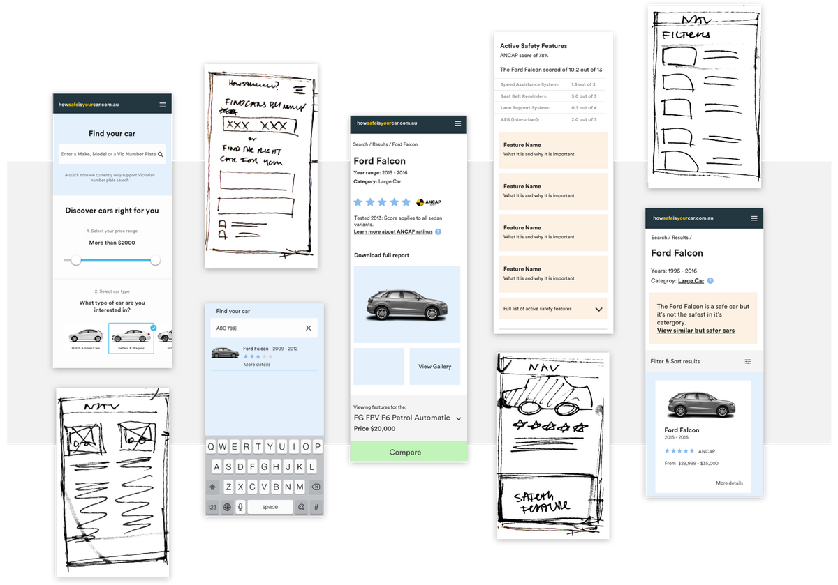
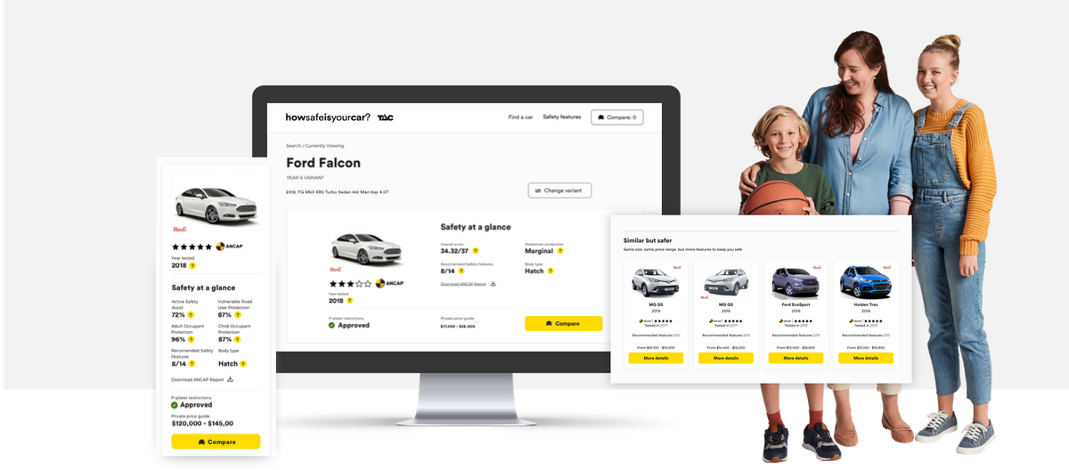
Car details are then presented in a simple scanable way with high-level information captured and summarised with more detail available for those who seek it.
We also created car comparison as it was something requested during moderated testing sessions. Many asked to have the ability to see options side by side to help them make a decision. However comparison not being the simplest things to execute on mobile, we used the ecommerce patterns of a mini cart to make it easy for people to collect cars they wanted to compare.
The interface is designed to entice interaction and feel effortless. Visual elements such as the systematic use of colour helps to place prominence on things like buttons, sliders and other interactive components.
While there was an abundance of great data it was up to us to make connections that made it more meaningful. Like presenting similar but safer recommendations that had a complex set of business rules and logic powering what should be displayed based on scoring and safety weighting.
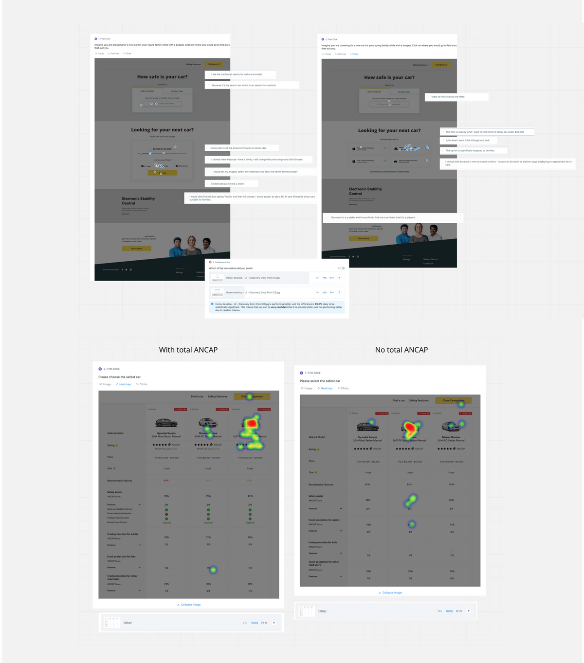
We used both moderated testing as well as online testing to gain confidence on what people needed as well as the usability of some of the more complex features and content.
A heavily data driven website where most of the front end components are driven by data pulled from other providers like Redbook and ANCAP.
A very interesting project, and this summary doesn’t do it justice… So go on now look up how safe your car is…
Lesson:
The balance of design influencing data and data influencing design is an act that requires early prototyping and compromise.